This particular design trend found its footing in Microsoft’s Windows Phone 7 design. It was all big, buttons and bright colors with no extraneous texture or ornamentation—ideas that later spread to Windows 8, iOS 7, OS X Yosemite, the Android L release, and many apps running on those platforms. Software is no longer focused on making onscreen content look like real-world objects. Our screens aren’t made of felt or paper, so why should they look that way?
That said, there are plenty of things about older designs that new designs haven’t figured out. We put our collective heads together and came up with the following list of modern UI design trends that get our blood boiling. We’re sure there are more things that could make this list, but we’re trying to keep our blood pressure down. If you’ve got some hate to spread around, kindly deposit it in the comments section.
Too-flat, text-only “buttons”
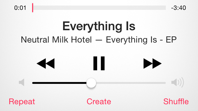
Those tiny text labels across the bottom of the screen are actually buttons, not that you can tell.
Andrew Cunningham
One of the common UI elements ushered in by iOS 7 is the button that doesn’t look like a button at all (and Google is moving in that direction with the Android L release). Touch-oriented interfaces tend to be a little too subtle about how to navigate them to begin with, but iOS’s new favorite trick of making the thing you’re supposed to click into highlighted, or sometimes not-highlighted, text means I’m prodding at my screen a lot more often now with too little or too much to show for it. And because the OS isn’t consistent about how it identifies buttons, I can’t build a reflex in response to certain colors or fonts. I’m always experimentally clicking around and sometimes ruining things.
Daring Fireball highlighted this problem a while ago with the short-lived blog UX Critique, which pointed out that a number of UI elements in iOS 7 are buttons masquerading as text, and sometimes vice versa. The blog shows, for instance, a screen for editing an audio file where the world “Trim” appears twice, one is a button, one is a title, and the only difference between them is one’s text is just a hair thicker.
Tapping text took some getting used to, as there is no consistent coded color to distinguish it as a button, but I’m finally making peace with it. Possibly worse, though, is the lack of consistency in how the OS highlights a button that is tapped. I’m looking at you, shift key.
Full Story: The software design trends that we love to hate | Ars Technica.

